We have conducted a multitude of A/B tests, many for B2B clients. Here we will showcase the top performing tests that we ran for paid media landing pages – where the goal was to increase form submissions and generate qualified leads
Test the Location of the Form on the Page
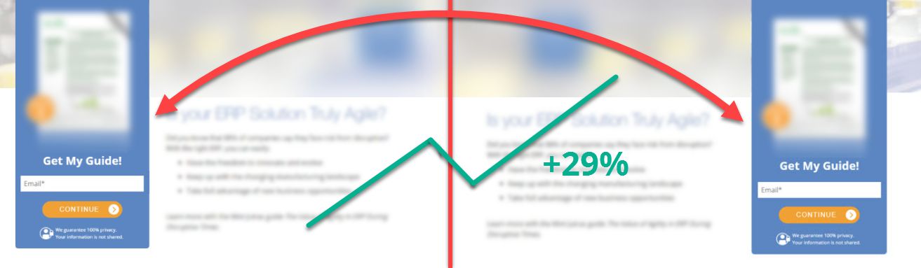
In one test, simply moving the form from the left side of the page to the right side of the page increased form completions by 29%. Doing so meant that the landing page headline and supporting benefit bullets were seen first by the visitor which increased their desire to get the asset. Secondarily, they saw the form and how to get the asset which increased the number of visitors who were then willing to provide their information to get the asset.
In another test, the title of the asset alone created enough desire in visitors where a single column landing page with the form directly under the asset title increased form submissions by 29%. The benefit bullets and asset image were reduced in prominence and placed below the form and below the fold on the page because this information got in the way of most visitors who already knew they wanted the asset just from reading the title.
Remove “About Us” Content on Downloadable Asset Lead Gen Landing Pages
By removing the additional tabbed content about the company we were able to increase form completions by 31%.
We as companies like to tell everyone why we are great and what makes us unique. However, in the context of our B2B lead generation landing pages, this information was not directly relevant to the Call to Action and what we wanted visitor to do in downloading the asset. By simplifying and focusing the content on the page to only be related to the asset, we removed all distractions from the action we wanted and visitors easily navigated through the experience and converted at a much higher rate.
Increase Font Size and Use a Clear, Legible Font
Increasing the size of the font on the landing page and replacing the company’s branded font with a simple san-serif font increased form submissions by 65%.
First and foremost visitors need quickly and easily read and answer the questions of what they are getting, why they should care, and how they can get it. By using a larger, simpler font we decreased the friction and effort required by the visitor to answer these questions which resulted in more visitors deciding to get the asset and convert.
Don’t Miss a Beat!
Receive current information, expert advice, helpful tips, and more…
* Your privacy is important to us.

Abraham is the head of the Conversion Improvement department. He leads landing page testing strategy, implementation and analysis along with client communication and delivery. Abraham brings 8+ years of experience in conversion improvement, landing page testing and usability with a specific focus towards B2B and business with a complex sale.