
By default, Google Analytics loads reports in the data table view. This setting can be changed to present data in another visual format. In this post I’ll discuss how to take advantage of Pivot Tables. I’ll show you how to modify pivot table options, structure and format to better analyze and understand website performance.
Google Analytics Visualization Options
In addition to data table (the default setting), visualization options in Google analytics include Percentage, Performance and Comparison. These options are available next to the option to filter your data. Google Analytics also includes an option to visualize the report in a Pivot Table. It is the very last option in the row:

The pivot table will include the original report with an option to pivot the data by a secondary dimension. While this is similar to simply including a second dimension, a pivot table presents the data in a much easier to understand format.
Pivot Table Components
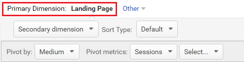
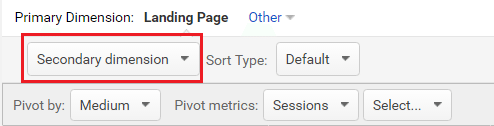
Primary Dimension – This is the primary dimension of the report that was initially selected. It is the first component of the pivot table.
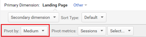
Pivot by Dimension – This is a secondary dimension by which the report is pivoted. It appears at the top row of the pivot table.
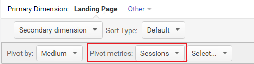
Pivot Metrics – This is the primary metric that appeared in the report that was initially selected. It can be changed in the drop down menu on the top left side of the pivot table.
Adding a secondary dimension – As in the default Data Table view, a secondary dimension can be added to a Pivot Table. It is added in the same way, by clicking on the Secondary Dimension option. It will be the second column of the Pivot Table.
Adding a secondary pivot metric – By default, a Pivot Table will have only one metric. A second one can be added by selecting it in the options next to the primary Pivot Metric.
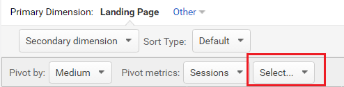
Available Pivot Metrics
There are four different categories of pivot metrics that you can select in your Google Analytics Pivot Table. You can select the metrics you need at the very top of your report overview. Once you select your metric category the metrics will be available from the drop down menu of the pivot metrics, as shown above.
Summary – This category is selected by default and contains all metrics covered by the other categories.
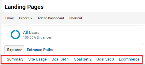
Site Usage – This category includes metrics like sessions, % of new sessions, bounce rate, and pages per session.
Goals – This category will be split by the number of goals you have set-up in your view. It contains goal conversion rate, goal completions, and other conversion data.
eCommerce – If you have eCommerce enabled, this category of metrics includes transactions, revenue, average order value, etc.
Insightful Pivot Tables
Here are some of my favorite pivot tables.
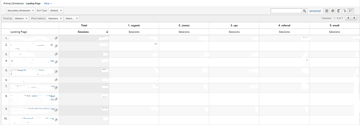
Landing Page Analysis
- Primary Dimension – Landing Pages
- Pivot by – Medium
- Pivot Metrics – Sessions
This pivot table will give a clean data overview of sessions to each landing page sent by the different advertising mediums you are using in your marketing strategy. You can access this report by going to Behavior – Landing pages, then select pivot table view and pivot by Medium.
Channel Analysis
- Primary Dimension – Channel
- Pivot by – Source
- Pivot Metric – Sessions
This Pivot Table will overview each channel by the source sending traffic to your website. You can compare sources that are sending a number of traffic types including organic and paid, organic and referral, display and referral, etc. Go to Acquisition – All Traffic – Channels then pivot by Source.
New vs Returning Visitor Analysis
- Primary Dimension – Channel
- Pivot by – User Type
- Pivot Metric – Sessions
- Second Pivot Metric – Goal Completions
This Pivot Table will break down sessions by each channel for both new and returning visitors showing data on which channels are reaching new audiences or encouraging users to return. Adding a Goal Completion Metric will provide even further insights.
Browser & Operating System Analysis
- Primary Dimension – Browser
- Pivot by – Operations system
- Pivot metric – Sessions
- Second Pivot metric – Completed Transaction
This report will provide great data if you are looking to test your website in different environments, or to understand if there is a technical issue in a certain browser and operating system combination.
Conversion Analysis
- Primary Dimension – Landing Pages
- Secondary Dimension – Medium
- Pivot by – Location
- Pivot Metric – Sessions
- Secondary Pivot Metric – Goal Conversions
This is quite a data-rich report. You’d be able to see on which landing pages, filtered by medium, users converted and whether there are discrepancies between the amount of traffic driven by a certain marketing channel and the conversions generated by that channel.
Final thoughts
There will never be a shortage of data when you need to analyze traffic and audiences! The above examples are simple ideas to get you started with Pivot Tables in Google Analytics. If you want to dig deeper you can use Pivot Tables in custom reports (here is a great article on How To Create Pivot Table-Friendly Custom Reports) and you can use Pivot Tables with various advanced segments. All these should give you intelligent insights to take action.
Don’t Miss a Beat!
Receive current information, expert advice, helpful tips, and more…
* Your privacy is important to us.